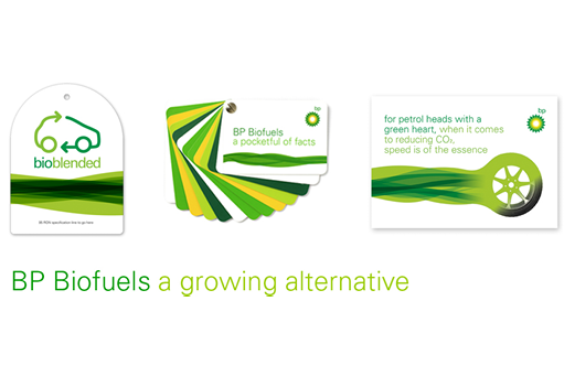
BP Biofuels With the creation of BP Biofuels it was essential to announce important strategic developments, build business and inform and educate the industry, governments and opinion-formers. Any look and feel needed appeal, relevance, resonance, and authority. With BP brand guidelines forbidding sub-brands we saw possibilities in three identifying elements. The ‘bioflow’ graphic, strapline: ‘a growing alternative’ and businesslike headlines and copy.
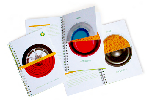
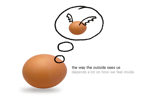
BP Sales and Marketing Academy BP’s Sales and Marketing Academy was set up to make marketing and sales staff more effective and help their career progression. Our ‘Drawing on experience’ and ‘Drawing on your potential’ themes took a light-hearted, and occasionally cheeky, visual approach to objects representing situations or feelings, enhancing them with a drawn line. Alongside complementary copy lines this gave an instantly recognisable personality to an arm of the business that makes, as we put it, nothing except a difference.
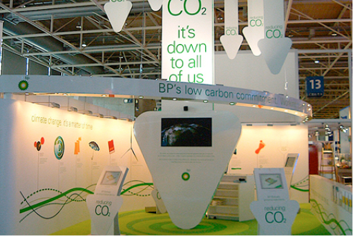
BP Alternative Energy - Biofuels (Hanover Trade Fair) The stand area was small. Yet the CO2 reduction message was substantial. Our solution was to build up, to bring CO2 down. Target Neutral was BP's own nomenclature, to which we added the slogans and design. This was used with dramatic effect overhead and underfoot, within the carpet itself. In adding a 'Timeline' wall we were able to chart progress and set targets with simplicity and impact.
+44 (0)1234 740 757
info@andrewhamlet.com
© Andrew Hamlet: Progressive Branding